Art Discussion - Colour Language
Colour as Narrative
Colour Theory is one aspect of my Art process that is very dear to my heart. It is at the core of the Art I make. I do enjoy creating narration and story with my colour choices.
Even the absence of colour plays an important part in how your work is understood.
Let us begin by thinking about Colour as a time travelling tool. We can transport to a moment in our own memory where something joyous occurred. The lovely wonder on a long walk in the autumn breeze or the scent of that freshly blossoming rose in your garden.
Regardless of the memory you choose, we can associate colour to that moment.
Think of tones that make you feel happy when you look upon them. Pinks, Reds, Yellows are usually associated with light hearted moments. Blues and Greens can be associated with calm, relaxing moments.
Spend some time pondering how each of these colours make you feel. Use this in your own Art to translate these feelings to your viewers.
Pro Tip:
“…Where do I begin with Colour. It is at the very centre of everything I create. For me, an Artwork begins with a colour grouping. I may come up with it on my own, or experience it in my life. Whichever way, a new drawing always begins with how I feel about a certain colour grouping…”
Everyone’s individual experience with Colour will be different. A Colour that makes you feel joyous may make others feel uneasy. This is the beauty of Art. As Artists, we have a wonderful opportunity to open ourselves to these varying interpretations.
In my studio classroom, I spend a lot of time breaking down the immense world that is Colour Theory. It is the major topic most people come to me with questions. If you are someone really wanting a distilled introduction to Colour for the Artist, I do provide Online Tutorials in this arena.
Feel free to browse SRA’s Online Catalog of Colour Theory for the Artist. I share a lot of vital information about how the Colour Wheel works and how you can create interesting colours all on your own.
Colour as persuasion
You can use colour is a number of ways to manipulate your viewer. Most of the joy of creating Art is the unexpected collaboration of colours that you never really thought about in combination.
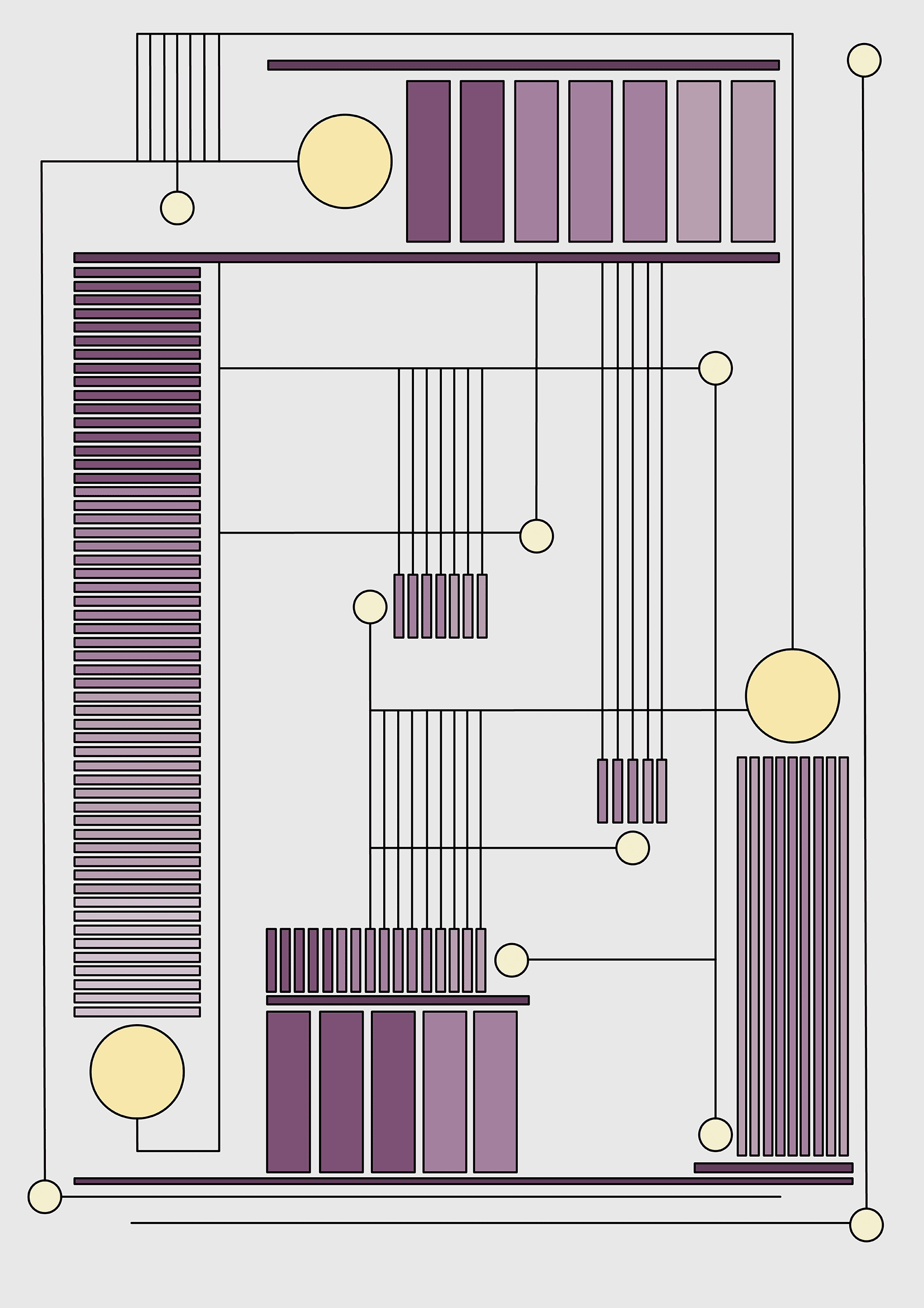
You can use colour to illustration the narrative direction of your design. Think about placing certain aspect of your design in certain colours. Deeper tones can help to recede certain objects, whereas lighter tones can cause these objects to come forward.
Sometimes, you can play with this rule. Try tinting objects you want to come forward in reverse to the traditional idea. This may not work for all colour combinations, but thats half the fun.
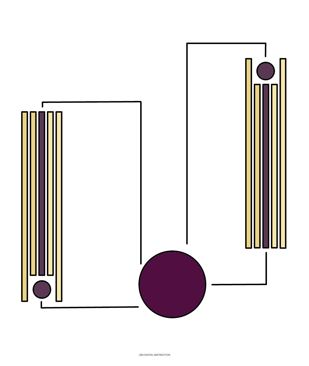
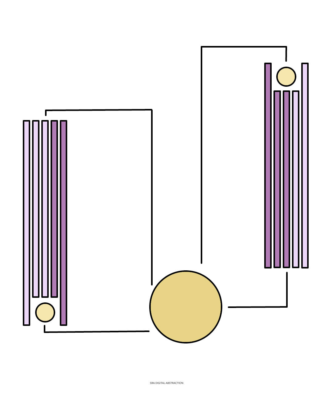
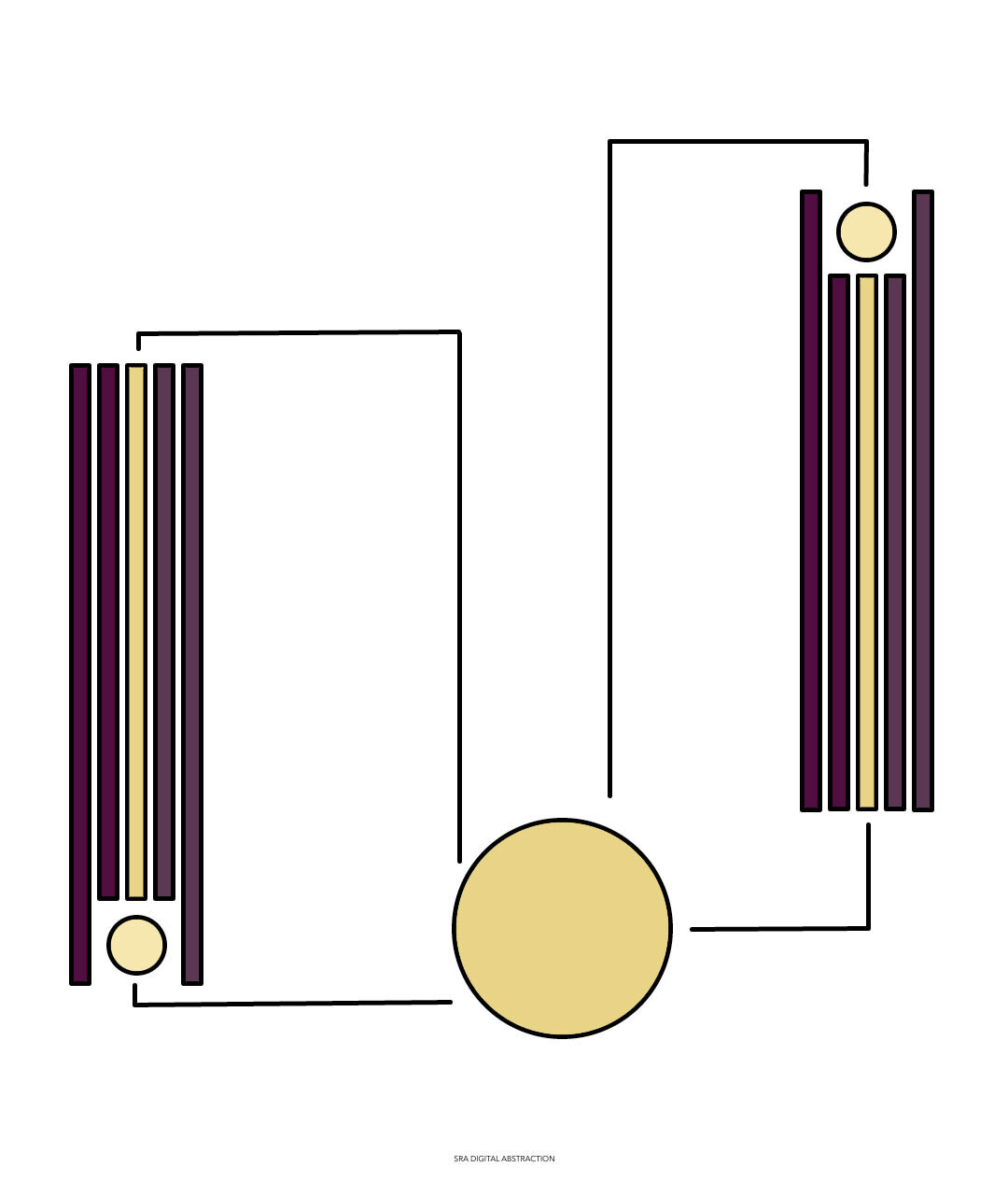
Begin by pairing two colours you think work well together. This is the base of your colour palette. Proceed to create lighter and darker versions of each tone. By doing so, you allow the palette to be diverse whilst still maintaining a simple, minimalist appeal.
By creating your colour palette in this way, it will ensure that all the colours in your design work in unison.
Pro Tip:
“…I do enjoy all colours. I believe that there is a time and place for each tone. However, I am impartial to a cool toned palette. I enjoy the moisture-like feel cool tone colours bring to any Artwork. I tend to gravitate towards Blues, Violets and Greens. They say tranquility and gentleness to me, without being over bearing…”
Looking Ahead
As always, Thank you for taking time to visit my blog. I hope these discussions shed some new light of aspects of your own Art that needed tending.
If you enjoyed this discussion, feel free to join SRA’s Virtual Classroom for Digital Art 101. Here Saabira breaks down the wonder and importance of good design in any Art making process.
Wishing you all the best in your own Artistic Endeavours and as always Happy Drawing!