THE BLOG
YOUR DAILY DOSE OF ALL THINGS ART
Join the Mailing List
New Blog Posts right to your inbox
TECHNIQUE
I was 1st drawn to Alcohol inks because of their absolutely brilliant tones and deep saturated colours. I was looking for a material that felt light on the page, something that held its own when completely washed out but still could be used in super pigmented applications.
Deciphering the mystery of the colour palette is something every student comes to class wanting to know. How do I know what colours to put together in my painting to make my ideas clear to the viewer. Firstly, ask yourself, what do I want to say with this artwork?
The eternal question for any creative soul, is where do I begin with colour? When I teach Colour Theory to my students, I always begin with redefining what colour means. To an Artist, Colour is not just a visual que that signifies association. Rather, Colour comes from the mind, a hidden memory or nostalgic thought.
If you want to create deep dense brushstrokes that stay frozen in time, Oil Paint is the one for you. If you want to create slick, glossy texture, that looks wet after years of curing, Oil Paint is the choice. And, if you want that delectable translucency akin to steam lifting from the rim of a cup of tea…
INSPIRATION
Pablo Picasso once said, “… good artists borrow, great artists steal.” What he really meant was, a Great Artist can realise what makes a certain piece of imagery good and distill these thoughts into something better. It is the reimagining of an element that makes the work completely your own.
Creative souls view the world in a very different way. For us, everything is a stimuli; the scent of a flower, the particular blue of an evening sky, even the touch of a leaf of an unusual plant. Every sensory experience resonates as a form of inspiration for a new piece of Art.
DESIGN
Colour Theory is one aspect of my Art process that is very dear to my heart. It is at the core of the Art I make. I do enjoy creating narration and story with my colour choices. Even the absence of colour plays an important part in how your work is understood. Let us begin by thinking about Colour as a time travelling tool.
Lines represent a passage of time and an overall sense of motion. They link one aspect of a drawing to another, allowing your viewer to traverse your picture plane in a very relaxed way. You can create very interesting imagery with just a simple line choice. Tension can be achieved by duplicating lines in an almost parallel format. This recurring choice reinforces a single idea over and over again, in a persistent way.
Words and physical gestures are how most people communicate their thoughts. We as a social construct use the written word, a spoken language and bodily gesture to share our ideas and thoughts with each other. Have you ever felt as if you didn’t have the right words to describe how you felt about something? Creative thinkers, have devised another way.
HISTORY
There is so much to be said about this prolific Artist. I was first introduced to Vincent Van Gogh in a 1st year Art History Course at University. I remember knowing his name, and his famous painting Starry Night. To me, his work was so unique and different, it made me think, going against the flow could have its reward.
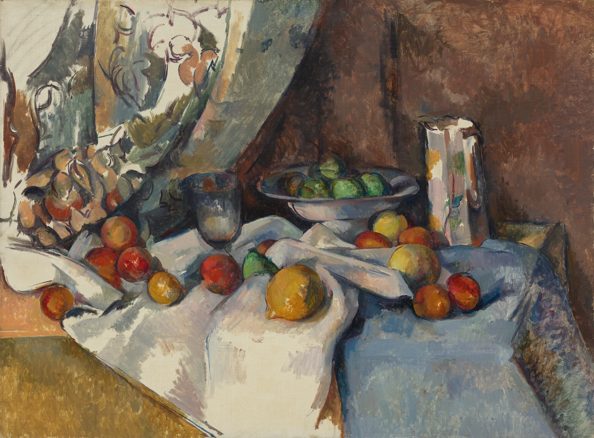
Paul Cézanne is widely appreciated as the forefather of modern interpretation of Colour. He is credited as the 1st Artist to use complimentary colours to create spacial depth. His extensive love and deep appreciation for emotion and colour connection resonates throughout his entire body of Work.
Edvard Munch was born in 1863, in the small village of Adalsbruk, Norway. Munch came of age in the first decade of the 20th century, during the peak of the Art Nouveau movement. His Art heavily follows the Art Nouveau focus on all things organic, evolutionary and mysteriously instinctual. Munch’s work discusses human mortality, sexual liberation and mental health issues like anxiety and depression.


