Art Techniques - The Mystery of the Colour Palette
The right colour palette for you
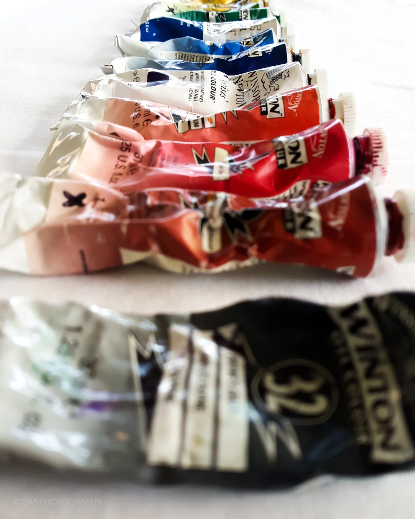
Deciphering the mystery of the colour palette is something every student comes to class wanting to know. How do I know what colours to put together in my painting to make my ideas clear to the viewer.
As an Artist, this process can be as easy or as difficult as you want it to be. Firstly, ask yourself, what do I want to say with this artwork?
Your answer should be distilled into a couple of adjectives and maybe a sentence or two about what you felt when you came across the subject matters for your painting.
Then ask yourself, what colours come to mind when you think of those adjectives? Is there a particular tone that you gravitate towards when you think of tranquility, or rage, or heat or wet coolness?
Use these words to choose the base of your palette.

For me, I like to use groups of colours that resonate a particular emotive response personal to me. I like using versions of teal, purples and blues as my base for the majority of my paintings.
Pro Tip:
For me, these colours represent a gently faded memory; a moment that is no longer real, but still alive. Purples can have a very somber tone to them, I like using these quiet, calm colours to add another layer of nostalgic bittersweet emotion to all my works.
juxtaposition is not your enemy
Now that we decided on the base colours for our palette, let us turn our attention to the overall mood we want to portray.
One method for achieving this is by using contrast in our painting.
Juxtaposing subject matter and reinforcing this conversation with your colour choice can help to clarify your intention to your viewer.
Using colour with this in mind will result in a more confident end product.
Upon finalising your composition, with all subject matter in their rightful places, ask yourself, how does this composition make me feel?
What are your subjects trying to say by placing them the way you did? Using descriptive adjectives here is also key.
Pro Tip:
I like placing my subject matter against a darkened, vacant background. This helps them remain a strong focal point in each of my works. Also, it allows for the background to carve out an interesting negative space that elevates my narrative tools.
Using colour to enforce this technique helps my viewer focus on what I want them to see and experience with my work.
In order to complete your palette, you will need to choose a final colour. This colour should enhance the adjectives answered in our previous question.
Choose either a colour near to (on the colour wheel) your base tones, to create a calming, tranquil and organic-like flow to your painting.

Artist: Saabira Razac. “Resistant”. Digital Print.

Artist: Saabira Razac. “Witheld”. Digital Print.
Or, you can be more adventurous and choose a complimentary colour (opposite on the colour wheel) to your base tones.
This will add tension, strength, confidence and if done correctly, still play into ideas of organic-like flow.
Pro Tip:
I like using a complimentary colour as my last selection. This creates a strong stylistic patterning to my palettes. I like pushing the boundaries of what colours can work well together.
I try to use colour themes for each of my paintings. Certain groupings create tranquility whilst others can add that bit of emotive tension I love.
The next time you choose colour for your Art, try these easy steps. You will notice that a more informed reasoning to your colour choice, ends up being a better painting.
As always,
Good Luck and Happy Painting.