Art Techniques - Understanding Colour, like an Artist
So many Colours, where to begin
The eternal question for any creative soul, is where do I begin with colour?
When I teach Colour Theory to my students, I always begin with redefining what colour means. To an Artist, Colour is not just a visual que that signifies association. Rather, Colour comes from the mind, a hidden memory or nostalgic thought that forces you to revisit a moment in the past. Colour is powerful enough to trigger a taste on your tongue, a fragrance in your nose or even a physical flinch in your body. It is the most persuasive tool any Artist possesses.
Once you learn to see colour like an Artist, you will begin to understand the grand importance it plays in any Artwork. For many years, Artists have been deciphering this amazing tool and formulating new ways to break the rules and gain the rewards of their efforts.

Mapping Colour, in your mind
Starting your journey in Colour Theory for the Artist, begins with simple association. A series of direct questions that help you understand how you as an individual see Colour.
What colours do you like?
It is very common for us to have colours we favour more than others. For me, I enjoy blues, violets and greens; for others it maybe yellows and reds. Regardless of your choice, we need to understand why we like certain colours more than others.
Think about your past, what colour was your favourite when you were a child? Was there a reason for this? For most, a colour you associated with a lot as a child generally becomes the colour you most favour. Likewise, there may have been a colour you absolutely disliked as a child, and you probably still dislike it to this day.
Regardless of the colour you choose to favour the most, the underlining thought is that, this colour shapes how you interact and perceive the world around you. This is a very persuasive tool in the Artist’s toolkit. Knowing how people interpret and favour certain colours for specific reasons, can help the Artist really fashion a mood or emotive response from the viewer.
Artists use Colour to better carry their point across. The use Colour as a descriptor for mood, emotion, narration and stance. Here are 4 simple ways Colour can be used in Art to make the Artist’s voice stronger.
Subjectivity and Perception

Jimson weed. G. O’Keeffe. Cc 1936
Storytelling with Colour
Our associations to colour play a big part of how we interpret colour. Personal experiences and distinct memories fashion how we interact with colour on a daily basis. This is what Artists term Colour Subjectivity. Harnessing this tool can greatly influence how the viewer interprets your artwork.
Subjectivity refers to the personal opinions and ideals of the individual that influence how they understand a stimuli. Perception refers to the overall subjective opinion an individual uses to understand and interpret the world around them.
As Artist, we use these two techniques, to mould and sway the viewer; using their own experiences, to better understand the Artwork before them.
Colour helps the Artist clarify their intention. It narrates the viewer, directing them where and what to look at. It helps to focus the viewer on the salient aspects of the work as they journey along your painting.
Food for Thought:
Georgia O’Keeffe takes you on the most whimsical circular journey about her Jimson weed painting. You feel the eye slowly circling about the painting, as you move closer and closer to the stamen of the painted flower.
You feel relaxed and calm, as your eyes linger on every twirl and point on this overseen weed. Here, Colour guides you, calms you and makes you appreciate this mere weed without you even realising it.
Subverting Expectation
The Artist’s stance and no other
It is the Artist’s responsibility to produce a fresh new approach to understanding the world around us. Artist’s use their own subjectivity to create a niche where their Art can be experienced and explained in a manner that sheds new light of the ideals and behaviours of the status quo.
Here, Colour can be used to force the audience to experience a new, distilled interpretation of an event. Some Artists have used monochromatic palettes to either mute a harsh moment represented or force the viewer to see clearly the reality of the situation.
Food for thought:
Pablo Picasso used colour as a major tool in expressing his Art. In his famous painting, “Guernica”, Picasso removes all colour from the mural. It is devoid of colour, making the scene flat, impactful and loud.
The expressions on the figures’ faces call to the pain, the hurt and the blood that we know to have painted the reality of this massacre. Here, Picasso refuses to use colour. No colour makes you see the red of blood, feel the heat and the anguish without it physically being represented.
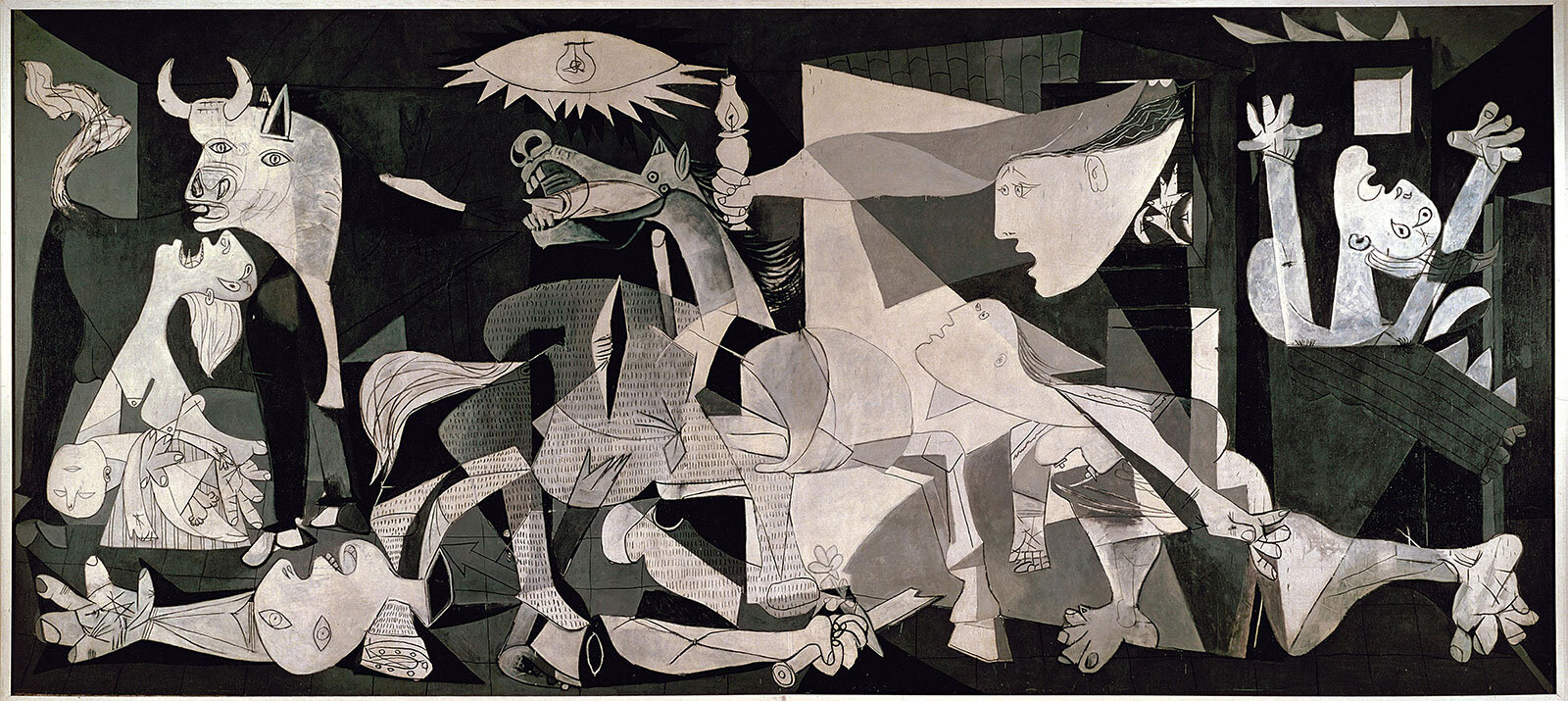
Guernica. P. Picasso. Cc 1937
Pleasurable Aggravation

Man in Bowler Hat. R. Magritte. Cc 1964
Pushing the boundaries… watching it bend
If there was ever one Artist that forced you to say, ahhh, you’ve got me… its Rene Magritte. Magritte’s work is a testament to an Artist that could blend word and visual with a neat little bow. Known as the master of Surrealism, Magritte toys with ideas of subjectivity by questioning every reason we have for object word association.
Magritte proposed that an object and its word signifier held no relation. That the word was only an association that we (society) agreed would signify that specific object. To put it plainly, a rose could be a chair, if we chose to call a rose a chair. The object, so called a rose, would still be the same if we decided to now call it a chair.
His work confronts your every subjectivity, forcing you to see what isn’t there. He allows the viewer to imagine the face of his mysterious figure as well as question the believability of a particular moment.
Food for thought:
Not only does Magritte use colour to subvert your expectations, he adds on with symbols, misdirection, illusion and pretend. His paintings are covered in gently muted natural tones; as if it were a sunny, perfect day, void of wind, sound or air.
His Artworks reside in a world that is not real, but feels like it could be. This paintings describe scenes that make sense at first look, but become impossible the longer you stare.
Emotive and expressive Hold
A physical presentation of an intangible moment
Every Artist will tell you that Colour is directly associated with Emotion. For us, Colour acts as a visual representation of mood, nostalgia and thought. Blues, greens and violets tend to induce tranquility, gentleness and peacefulness to any artwork. Reds, oranges and magentas are seemingly joyful colours, but when used correctly can create tension, stress and even aggression.
Food for thought:
Artists Ernst Ludwig Kirchner was a master at manipulating joyful colours into tense, anxious and confronting tones. His paintings primarily depicted social settings in the early 1900’s, coloured in bright, vibrant pinks, oranges and yellows contrasted strikingly with deep violets, blues and greens.
Kirchner’s figures are painted in garish tones of magenta, greens and yellows. They appear sickly feeling and very haunting. He uses colour to influence the viewer in feeling claustrophobic, uneasy and even frightened. His paintings are social commentaries discussing the unsettling nature of European life at the turn of the 20th Century.
Expressionist paintings like these, have stood as a juxtaposition of fun, playful colours represented in a very dark and unsettling way.
One can see a beautiful floral painting done in the colours here, but twisting them in this manner shows you that when you break the rule right, greatness can happen.

Street Dresden. E. Ludwig Kirchner. Cc 1908
Tip of the Colour Iceberg
Understanding Colour through the eyes of an Artist is truly an impressive journey. Every Artist has their own method and understanding of how they represent their thoughts to the world. The underlying acceptance is that Colour needs to spark a thought in the viewer’s mind. Art should always ignite a feeling or emotion within the viewer.
If you are thinking about colour as a mechanism for story telling and emotion, then you are on the right path. You should always ask yourself, why do I choose to paint in a certain colour. If your answer is, it reminds me of something, then you are on the road to creating an artwork that means something to you.
And if it means something to you, then it will mean something to someone else.
As always, thank you for taking the time to read about how Artists use Colour. I just love digging deeper into the thoughts and methods Artists use to create their work. I hope you enjoyed this discussion.
Your Instructor,
Saabira Razac